
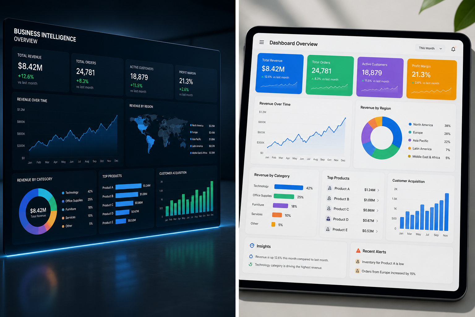
A leadership team should not need three meetings, two spreadsheets, and a last-minute request to understand whether performance is on track. Well-designed business intelligence dashboards bring the critical numbers into one trusted view, so teams can spot changes early, investigate the cause, and decide what to do next.
The difference matters. A dashboard filled with charts may look polished, but it creates little value if users cannot tell which metric needs attention, who owns it, or what action should follow. The most effective dashboards are decision tools, not reporting artifacts.
What Business Intelligence Dashboards Should Accomplish
Business intelligence dashboards consolidate data from systems such as CRM platforms, financial software, HR systems, operations tools, and spreadsheets. They translate that data into KPIs, trends, comparisons, and alerts that help leaders manage performance.
But consolidation is only the starting point. A useful dashboard should answer a specific business question. For example, a sales leader may need to know whether pipeline coverage is sufficient to meet the quarterly target. An operations manager may need to identify where service delays are increasing. An HR team may need to understand retention patterns by department or location.
The right dashboard gives each audience enough context to act without forcing them to interpret dozens of disconnected metrics. That usually means showing current performance, the target or benchmark, the direction of change, and the factors that explain the result.
Start With Decisions, Not Visuals
Many dashboard projects begin with the question, “What data do we have?” A stronger starting point is, “What decisions do we need to make more effectively?” This shift prevents teams from building reports around available data instead of business priorities.
Before selecting a chart or connecting a data source, define the decisions the dashboard will support. A department manager may need to reallocate staff. A nonprofit program director may need to determine which services are reaching intended communities. A finance leader may need to adjust spending before a budget variance becomes difficult to recover.
For each decision, identify the KPI that signals success or risk. Then establish the metric definition, target, reporting cadence, accountable owner, and expected response when the KPI moves outside an acceptable range. Without these agreements, teams can spend time debating numbers rather than improving results.
A practical KPI is more than a label. “Customer satisfaction,” for example, can mean an average survey score, a net promoter score, a complaint rate, or a retention measure. The dashboard should make the definition clear and use it consistently across the organization.
Build a KPI Framework Before Building the Dashboard
A KPI framework creates the structure that dashboard development needs. It connects organizational goals to measurable outcomes and keeps the design focused on what matters most.
Start with strategic objectives, such as improving profitability, increasing enrollment, reducing processing time, or improving service quality. Next, identify the outcomes that indicate progress toward each objective. Finally, select the operational measures that help teams understand what is driving those outcomes.
For example, revenue is an outcome metric, but conversion rate, average deal size, sales cycle length, and pipeline quality may explain why revenue is rising or falling. A dashboard that shows revenue alone tells leaders what happened. A dashboard that includes the relevant drivers helps them determine what to change.
Avoid the temptation to track every available metric. Too many KPIs create noise and dilute accountability. Executive dashboards often work best with a limited number of high-level measures and the ability to drill into detail when a result needs investigation. Team dashboards can be more operational, but they should still prioritize the measures employees can influence.
Design Dashboards for Fast Interpretation
Good dashboard design reduces cognitive effort. Users should be able to understand the overall story within seconds, then explore details only when needed.
Place the most important KPIs at the top of the page. Show actual performance alongside targets, prior periods, or relevant benchmarks. Use clear labels and plain business language rather than technical field names. If a metric is not self-explanatory, add a short definition or tooltip that explains how it is calculated.
Color should communicate meaning, not decoration. A consistent approach to favorable, unfavorable, and neutral performance helps users scan the dashboard quickly. However, color alone should not carry the message. Include values, directional indicators, and descriptive labels so the dashboard remains accessible and unambiguous.
Chart selection also affects decision quality. Line charts work well for trends over time. Bar charts are effective for comparing categories. Tables are useful when users need precise values or need to identify individual records. A single number with a target can be the clearest choice for a headline KPI. Complex visualizations may be appropriate for analytical work, but they are rarely the best first view for busy decision-makers.
Trust Depends on Data Quality and Governance
No dashboard can compensate for unreliable data. If leaders see conflicting revenue totals in different reports, confidence drops quickly, and users return to manual spreadsheets. That is why dashboard projects need data governance, not just visualization skills.
Data governance does not have to be bureaucratic. It begins with practical questions: Which source is authoritative? Who owns each metric? How often is the data refreshed? What happens when source records are incomplete or inconsistent? Who can access sensitive information?
Organizations should also document metric logic. A shared data dictionary can define calculations, source systems, filters, exclusions, and refresh schedules. This is especially valuable when teams use tools such as Power BI, Tableau, Excel, SQL databases, or cloud applications that may each contain similar but not identical data.
Security deserves equal attention. Financial, employee, customer, and student data may require role-based access controls. Not every user needs to see every record. A dashboard should provide the right insight to the right person while protecting confidential information.
Common Dashboard Mistakes and How to Avoid Them
Dashboard failures are usually not caused by a lack of technology. They are caused by unclear goals, inconsistent definitions, or weak adoption planning. Four issues appear repeatedly:
- Tracking too much. Limit the first view to the KPIs that support priority decisions. Provide drill-down pages for additional detail.
- Using inconsistent metric definitions. Agree on calculation rules before publishing. One version of a metric is better than several competing versions.
- Building for everyone. Executives, managers, and frontline teams have different questions. Create role-appropriate views rather than one overloaded dashboard.
- Treating delivery as the finish line. Monitor usage, collect feedback, and revise the dashboard as priorities, data, and processes change.
Training is part of adoption. Users need to understand not only how to filter a dashboard, but also how to interpret metrics, recognize limitations, and use findings in day-to-day decisions. This is where analytics capability becomes sustainable rather than dependent on a small technical team.
A Practical Path to Better Business Intelligence Dashboards
A strong dashboard program can begin with one high-value use case instead of a large enterprise-wide effort. Select a decision area with a clear business owner, available data, and measurable impact. Sales pipeline management, monthly financial performance, workforce turnover, service delivery, or program outcomes are often practical starting points.
Work with stakeholders to define the decision, KPI framework, source data, and initial dashboard layout. Validate early versions with real users before expanding the scope. Feedback from a manager using the dashboard during an actual weekly review is more valuable than feedback collected from a hypothetical demonstration.
Once the first dashboard proves useful, document the process and apply it to additional use cases. Over time, organizations can establish reusable KPI definitions, data models, governance practices, and training plans. This creates a foundation for broader analytics and AI initiatives.
DataLunch Consulting helps organizations combine dashboard development, KPI design, and practical workforce training so teams can use analytics with confidence. The goal is not simply to deliver a visual report. It is to help people make better decisions consistently.
The best dashboard is the one that changes a conversation from “What happened?” to “What should we do next?” Start with a decision your team needs to improve, build the smallest useful view, and let measurable action guide the next step.
 English
  French